Welcome! Log In Create A New Profile Recent Posts
Deer in Yosemite

The Moon is Waxing Gibbous (78% of Full)


Advanced

Re: closedcontour.com Yosemite Map

All posts are those of the individual authors and the owner of this site does not endorse them. Content should be considered opinion and not fact until verified independently.

closedcontour.com Yosemite Map
June 09, 2014 01:25PM
Hey folks,

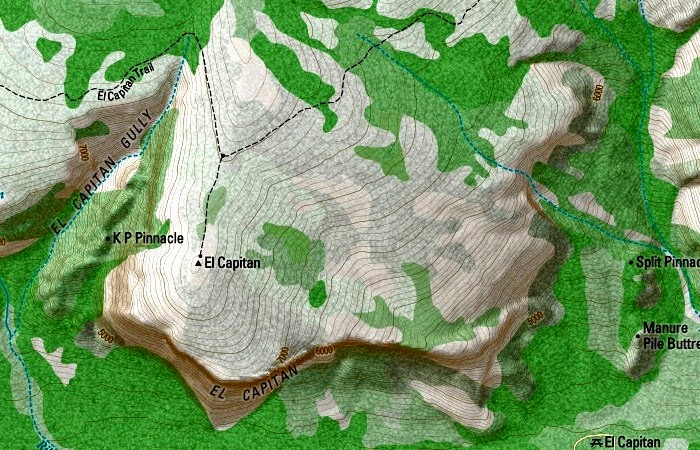
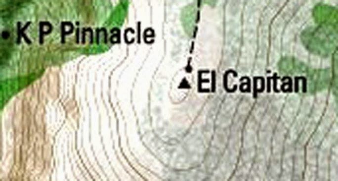
I've updated the landing page of closedcontour.com to a new map of Yosemite that I've been working on.

This map is easily modifiable and I'd like it to incorporate anything that might be useful to Yosemite visitors, so please send any comments, corrections, or changes to dan at closedcontour.com, or even better, file an issue on the GitHub project page.

Here's a couple of samples. Note Mount Andrea Lawrence, which was officially named in January 2013.


Here's a zoomed out view showing the major drainages in the north.


And last, a more zoomed in view showing the rock climber dome names and trail segment mileages.


Thanks,
Dan
avatar Re: closedcontour.com Yosemite Map
June 09, 2014 04:20PM
Dan,

Thanks for the updates to your website. I already love it, and now I'll love it more!

.
Re: closedcontour.com Yosemite Map
June 09, 2014 05:30PM
I love it. But is there some way to increase the contrast? It's like there is a fog overlay in place...
Re: closedcontour.com Yosemite Map
June 10, 2014 08:28AM
Very Nice! I like maps with a lot of detail. You've done a great job.
Re: closedcontour.com Yosemite Map
June 10, 2014 10:10AM
plawrence, wherever, cmon4day -- I'm glad you like the map and hope you find it useful.

wherever -- can you be a bit more specific about the contrast? Where do you find it lacking? When zoomed in/out? All the time? For example, in this example:


I can definitely see the need for increased contrast. In particular, the contour lines get washed out, especially in the dark green area E of the N ridge off El Cap. The "EL CAPITAN" label also gets washed out against the huge mass of contour lines. I could also go with a darker gray/black font when zoomed in.

Thanks for your comments.

Dan
Re: closedcontour.com Yosemite Map
June 10, 2014 10:23AM
Is there a legend for this map? I would like to know what the various shades represent.
Re: closedcontour.com Yosemite Map
June 10, 2014 10:42AM
Quote
cmon4day
Is there a legend for this map? I would like to know what the various shades represent.

I haven't made a legend but I can point you to a wiki page on GitHub that explains the landcover data for Yosemite (it's slightly different outside the park).

Dan
Re: closedcontour.com Yosemite Map
June 10, 2014 11:03AM
Quote
sayornis
plawrence, wherever, cmon4day -- I'm glad you like the map and hope you find it useful.

wherever -- can you be a bit more specific about the contrast? Where do you find it lacking? When zoomed in/out? All the time? For example, in this example:


I can definitely see the need for increased contrast. In particular, the contour lines get washed out, especially in the dark green area E of the N ridge off El Cap. The "EL CAPITAN" label also gets washed out against the huge mass of contour lines. I could also go with a darker gray/black font when zoomed in.

Thanks for your comments.
Dan

Yes, the contrast is too low. But in addition, even if you crank the contrast all the way up, you still can't see the contours in many places. Look at the woods below and to the left of el Capitan:


The contours need to be a bit heavier, and in a darker color than light brown. Maybe an opaque darker brown, with one notch bigger line width...


Edited 1 time(s). Last edit at 06/10/2014 11:03AM by wherever.
avatar Re: closedcontour.com Yosemite Map
June 10, 2014 08:30PM
1) Overall I'm liking this update a lot, thanks!

2) One place I see a need for the contour lines to stand out more (not sure contrast is the real answer) is on south-facing wooded slopes. One example is the wooded slope north of Dog Lake. Another example is just east of where the Dog Lake trail drops to CA-120 - note the contour lines extending east from that trail, to me they seem to fade as they go east. (edit) Wooded slopes on other exposures don't seem to have the same issue.


Edited 2 time(s). Last edit at 06/10/2014 08:34PM by ttilley.
Re: closedcontour.com Yosemite Map
June 10, 2014 10:07PM
Quote
ttilley
...One place I see a need for the contour lines to stand out more (not sure contrast is the real answer) is on south-facing wooded slopes. One example is the wooded slope north of Dog Lake....

Well, contrast is certainly part of it. The overall picture looks gray because much of the dynamic range is wasted. It's as if a 50% gray overlay is on top of everything.

But if you dial that out, things are still not right. Take a closer look:


If I were trying to sort this out, I would first change the contours temporarily from medium brown to solid black. If that fixes it, then just change the contours to be an (opaque) darker brown.

If the solid black contours are still faint, then you'll have to sort out the possibilities. Are the lines less than a pixel wide? That will average to gray at the pixel level. Are they on a layer that's not opaque? That would have to be changed.

There is a trick used for text symbols, where a thin white border is put on them. That makes them legible against both light and dark backgrounds. In this case, the contour linewidths are probably too thin for that technique. But something needs to be done...
avatar Re: closedcontour.com Yosemite Map
June 11, 2014 06:40AM
Darkening the contour lines makes sense - the area I mentioned near Dog Lake appears to blend into the combination of forested green and the 3D shading.
Re: closedcontour.com Yosemite Map
June 11, 2014 10:23AM
Quote
wherever
Well, contrast is certainly part of it. The overall picture looks gray because much of the dynamic range is wasted. It's as if a 50% gray overlay is on top of everything.

Quote
ttilley
Darkening the contour lines makes sense - the area I mentioned near Dog Lake appears to blend into the combination of forested green and the 3D shading.

I was intentionally going low contrast. The effect I was going for was what I like with a good poster map -- from afar you can see the general geographic structure, but as you walk closer more details surface. But the details should be balanced/not too contrasty/not too heavy as to draw your eye too soon. That said, when zoomed in, I agree the contrast is too weak and the contour lines too faint.

Luckily with a digital map I can have the best of both worlds! I left the outer zoom levels alone and adjusted the contrast and contour lines in the two most zoomed in levels. Here's an example:

El Cap:


Dog Dome:


FWIW, if you are technically inclined you can check out the project on GitHub and experiment with alternate map styling.

Thanks,
Dan
Re: closedcontour.com Yosemite Map
June 11, 2014 01:13PM
Much better. Thanks.
Re: closedcontour.com Yosemite Map
June 11, 2014 01:50PM
Very nice, well done. Nicely clean vertical lines. Vegetation overlays though providing an interesting graphic mosaic, overwhelm the vertical lines too strongly. Generally as anyone that has used topos knows, vegetation information from USGS sources is at best vague with some areas blank meaning treeless that ought to be green. And conversely some that show forest that are just mostly open bedrock with scattered trees in jointcracks. Basically a call of individual USGS map developers from what they saw on the satellite overlays. Interestingly the result is considerable variance even in the same areas between newer 7.5 minute and older 15 minute topos. With a topographic map vertical lines are always of primary importance to users. I've made some custom topo maps myself from an enlarged scale of 5 inch per mile scale though worked off a scanned source thus not the separated digital files. Used slightly different colors for each 200 foot vertical lines. That provided an enhanced elevation perception.

Traveled up Tenaya Creek and see you've added many of the names on the Wilderness Press maps like Whiz Dome's (camped there and did so off the north wall) and Dark Side Dome which I camped at during a 10 inch early June snowstorm one year just for the experience.


http://www.davidsenesac.com


Edited 1 time(s). Last edit at 06/11/2014 01:52PM by DavidSenesac.
Re: closedcontour.com Yosemite Map
June 21, 2014 10:10PM
Hey David,

Yes, I agree with you and whatever, the contour lines are too weak when zoomed in. I've just updated the map to have stronger contour lines and more contrast overall at the two most zoomed in levels, it's much better.

While climbing Vogelsang last weekend I was thinking about the vegetation cover for off trail hiking and how it should be styled. I think what would really be useful is if someone with botanical knowledge and off-trail hiking experience looked at the various possible landcover values to determine degrees of travel pleasantness. A style based on that metric would be ideal for planning and printing.

Dan


www.closedcontour.com
avatar Re: closedcontour.com Yosemite Map
June 21, 2014 10:43PM
All the changes in areas that I'm familiar with, I like. Thanks, Dan!
Re: closedcontour.com Yosemite Map
June 22, 2014 03:00PM
Much better! Thanks.
Sorry, only registered users may post in this forum.

Click here to login